Inspecting Bundle Size#
You can quite easily see the production size of your app by running:
yarn build
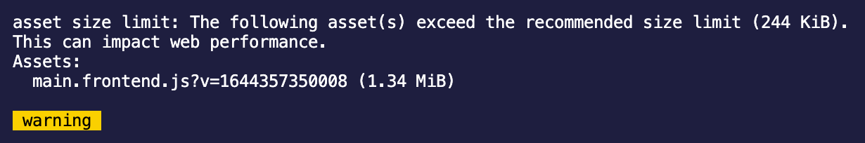
Above, we can see that the bundle size is 1.34mb, which is quite large. The note from Webpack says that we should aim for 244kb, which is really quite small. When we eventually move to serverless (via Vercel) for production frontends, we'll certainly aim for this smaller size. For now, with WordPress hosting, 600-700kb is fine. React itself takes up a bit of space on it's own.
Let's dig deeper into why the bundle is so large.
Our compile system includes the official Webpack Bundle Analyzer plugin. You can get a detailed analysis of the bundle size using the following:
yarn build
open dist/frontend/bundle-report.html
Your browser will launch the bundle report, which will look something like this.
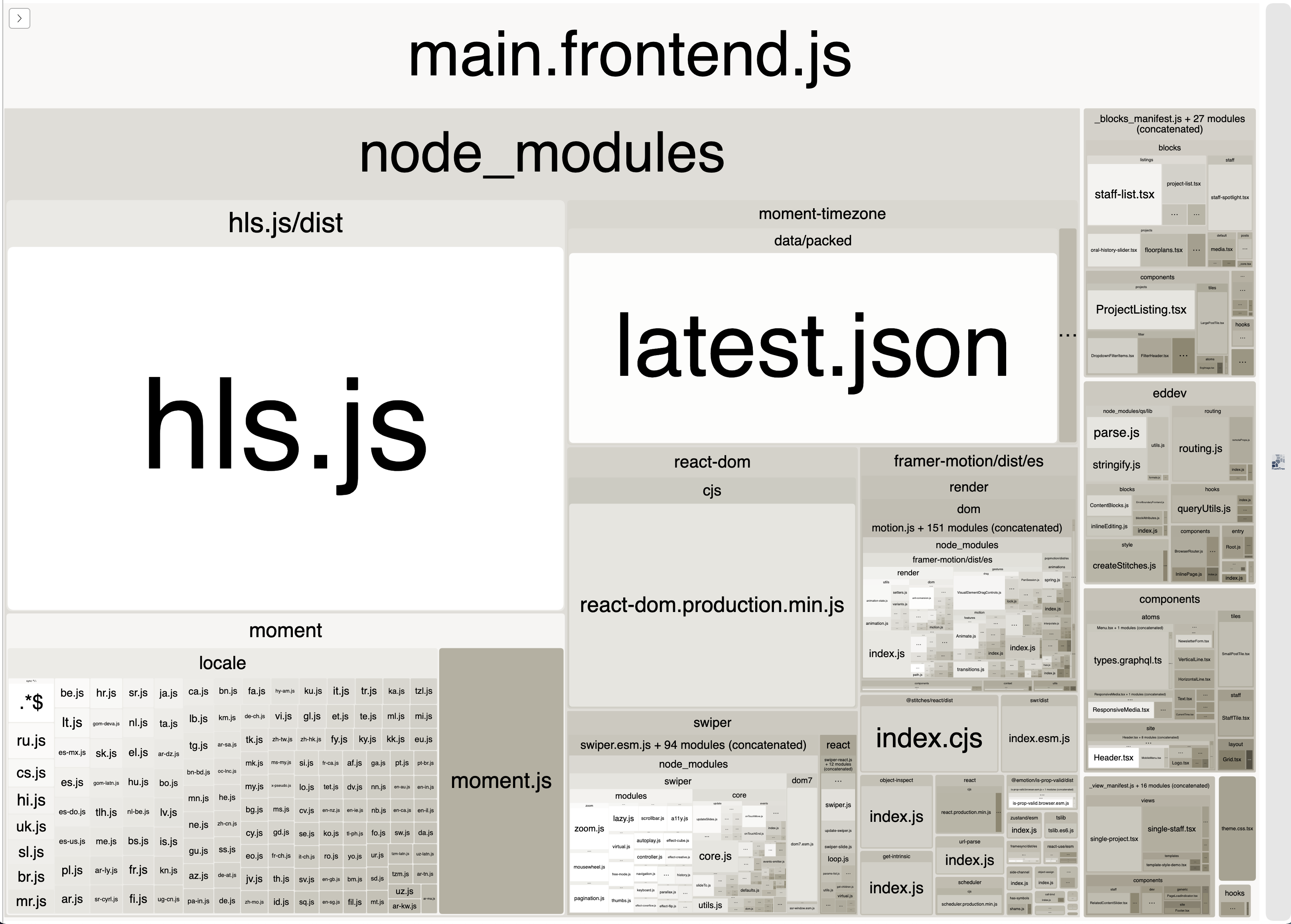
You can see in the example above, that hls.js and moment + moment-timezone are taking up a lot of the bundle size.
What can we do about this?
Choosing better libraries#
In the example above, moment is taking up SO much space, for something that is so simple. There are much simpler and smaller libraries that can be used instead.
- If all you want is date formatting, check out
date-fns— which provides a nifty date formatting function. The library is tree-shakable, meaning only the functions from that library you actually use in your code will be included in the bundle. date-fns → - If you need something a little more powerful, or if you need something related to timezones, check out
luxon, which is made by the same team that createdmoment. It's a much lighter alternative, because even though it supports timezones, it uses native browser APIs, instead of bundling info on every timezone/locale. Luxon →- (ps. Luxon doesn't come with TypeScript types, but you can install them using
yarn add --dev @types/luxon)
- (ps. Luxon doesn't come with TypeScript types, but you can install them using
It's always worth reconsidering the libraries we choose, looking for the most modern libraries for certain functions.
Dynamic imports#
Next up is hls.js. It's a library that provides a simple way to load and play HLS streams. It's not huge, but we probably don't need to include it in the main bundle.
Say we have the following code:
import Hls from "hls.js"

// ...

useEffect(() => {
  const video = ref.current!
  if (src) {
    if (video.canPlayType("application/vnd.apple.mpegurl")) {
      // HLS is already supported natively by this browser
      video.src = props.url
    } else {
      // HLS is not supported by the browser. Use Hls.js instead!
      const hls = new Hls()
      hls.loadSource(props.url!)
      hls.attachMedia(video)
      return () => {
        hls.destroy()
      }
    }
  }
}, [src])
We can quite easily refactor this code to use dynamic imports, which will automatically split that library into it's own file, which will be imported separately only if/when it's needed. If we still need TypeScript types for the module, we can also use import type syntax, which will only import the types for TypeScript's sake, and not the module itself.
import type Hls from "hls.js"

// ...

useEffect(() => {
  const video = ref.current!
  if (props.url) {
    if (video.canPlayType("application/vnd.apple.mpegurl")) {
      // HLS is already supported natively by this browser
      video.src = props.url
    } else {
      // HLS is not supported by the browser. Use Hls.js instead!
      // Declare a reference to the object, so we can can still destroy it when the component transitions out
      let hls: Hls
      import("hls.js").then(({ default: Hls }) => {
        // hls.js has been successfully dynamically imported.
        // Assign to the `hls` variable, so that it can be destroyed properly
        hls = new Hls()
        hls.loadSource(props.url!)
        hls.attachMedia(video)
      })
      return () => {
        // Destroy the hls video, as long as it was created in the first place
        if (hls) {
          hls.destroy()
        }
      }
    }
  }
}, [props.url])
Dynamicly imported components#
Similar to Next's next/dynamic (link), we have our own eddev/dynamic function. This allows you dynamically load components from the components/* directory using dynamic imports.
import { dynamic } from "eddev/dynamic";

const MyDynamicComponent = dynamic(
  () => import("@components/something/my-dynamic-component")
);

export default defineBlock("homepage/some-block", () => {
  return (
    <div>
      <p>I appear instantly</p>
      <MyDynamicComponent fallback={<div>Loading...</div>} />
    </div>
  );
});
All the same props from MyDynamicComponent are available, and the fallback (which is optional) is added as a prop by the dynamic function. It'll show the fallback while the component is loading.
When using this feature, you may notice a flash while the component is being loaded, since your page will actually render without the dynamic component first. This means that it may not always be suitable if the component is typically "above the fold". You may want to consider showing a placeholder div, and/or fading in the component using an animation once it's loaded.
It's also important to note that the dynamic function expects (by default), a default export. Normally, we prefer to export named components, but in this case, default is good.
// BAD: export function MyDynamicComponent() {}
// GOOD:
export default function MyDynamicComponent() {
  return <div>I'm a dynamic component!</div>
}
Internally, we use @loadable/components — you can see other options for dynamic via their docs. Next also uses this library!
Dynamically imported blocks#
The eddev/dynamic function requires a tiny bit of boilerplate to get going. If you'd like to make a whole block load dynamically, it's even easier. Note though that you wont be able to show a loading fallback.
Just add Dynamic: true to your block header comment — the compiler will spot this, and automatically turn it into a dynamic component. That's it!
/**
 * Title: Some Block
 * Description: A block that does something cool
 * Category: common
 * Icon: book-alt
 * Keywords: post
 * Templates: default
 * Types: page
 * Mode: preview
 * Supports multiple: true
 * Tags: root
 * Child Tags: none
 * Dynamic: true
 */
^ The last line is the important part. You can read more about dynamic blocks here.
Validating the changes#
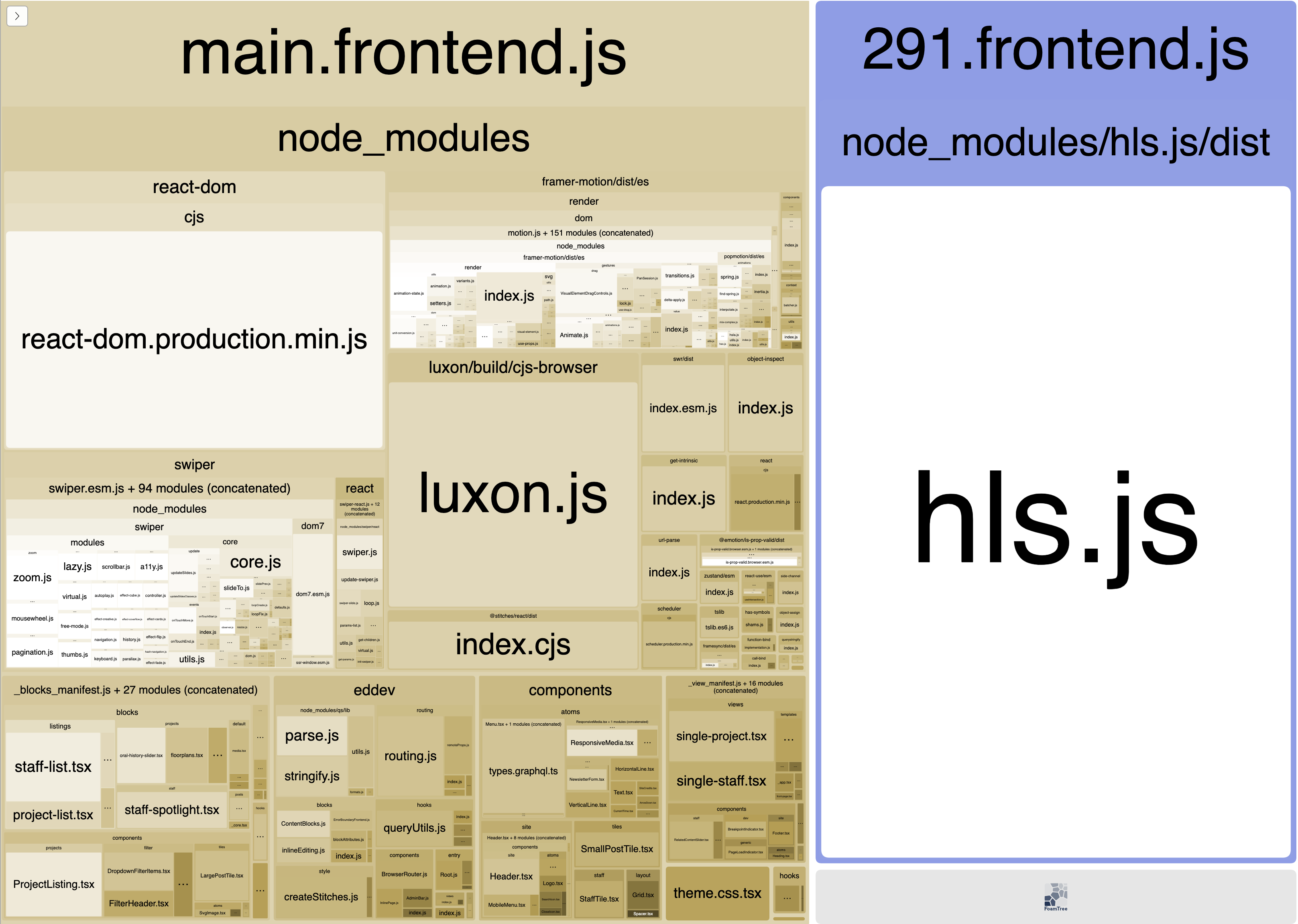
In the top sections above, we swapped from moment to luxon, and we also made hls.js a dynamic import.
After running yarn build again, and checking out the visualizer, we can see that these two small changes have reduced our main bundle size by HALF.

We could take this even further if we wanted, by making any blocks which use Swiper dynamic blocks, as discussed above.